Arimo Design Challenge — a transit kiosk, ten hours, no shortcuts
A timed design test: reimagine how commuters buy and refill transit cards on a 10-inch kiosk. I treated the clock as the brief — real riders at Grand Central, decisions scored on a matrix, and a tested hi-fi prototype, all inside ten hours.
Duration
10 hours, time-boxed
Team
Solo, end-to-end
Role
Research → hi-fi prototype
Setting
NYC Subway kiosks
Year
2019
00 Overview
The Moment & The Brief
The brief: design a transit-stop kiosk where regular commuters buy and refill their cards — show the flow, the reasoning, and at least one hi-fi mockup. Ten hours, start to finish. My reframe: with a hard time-box, the deliverable isn't just screens — it's showing exactly where evidence, decisions, and craft each earn their minutes.
Kiosks make people anxious
Lines pile up behind whoever is decoding fare plans at the screen. Locals fly through; first-timers stall on plans and payment. Two HMWs: reduce that anxiety, and make buying a card intuitive.
Three concepts, tested, with trade-offs priced
A fast default-value purchase, a one-click preset refill, and a card account — chosen from nine candidate flows on a user-value × engineering-effort matrix, then validated with click heatmaps and an 8-rider survey.
Solo, end-to-end, on the clock
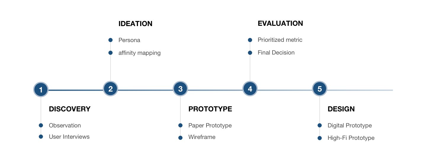
Field observation at Grand Central during the morning rush, six intercept interviews, affinity mapping, flows, sketches, hi-fi prototype, and usability testing — every step time-boxed.
Where the ten hours went
Watched 20+ riders at 4 Grand Central kiosks during the 8am rush
Ran 6 intercept interviews and synthesized them into an affinity map
Drew 3 candidate flows per scenario, scored on user value × build effort
Shipped hi-fi screens and tested them — click heatmaps + preference survey
01 Context
The Clock Is Part of the Brief
Ten hours forces the question every real project asks eventually: where does evidence matter most, and what are you willing to decide without it? I planned the time like a budget — research where the risk was highest, craft where the evaluation would happen.
HMW 1
How might we make commuters less anxious when they buy or refill at a transit kiosk?
The line behind you is the real pressure. Speed for the person at the screen is calm for everyone behind them.
HMW 2
How might we make buying a transit card intuitive?
Fare plans are policy documents rendered as buttons. First-timers shouldn't need to understand the MTA to ride it.
02 Clarify Problems
Two Hours at Grand Central Beat Ten Hours of Guessing
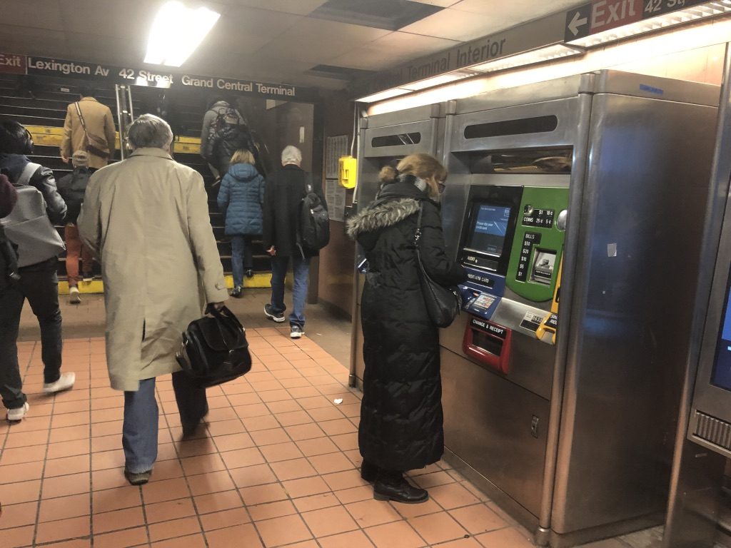
Instead of designing from memory, I went to the machines. Thirty minutes of observation at four kiosks during the 8am rush, then six intercept interviews — enough signal to know exactly which problems deserved the remaining hours.
Field Observation · Grand Central, 8am
The Line Is the Interface
20+ riders, 4 kiosks: each person took 1–5 minutes, and the queue never shrank. Locals tapped through on muscle memory. Travelers stalled on plan choices; cash payers panicked mid-flow and switched to card. The kiosk wasn't slow — uncertainty was.
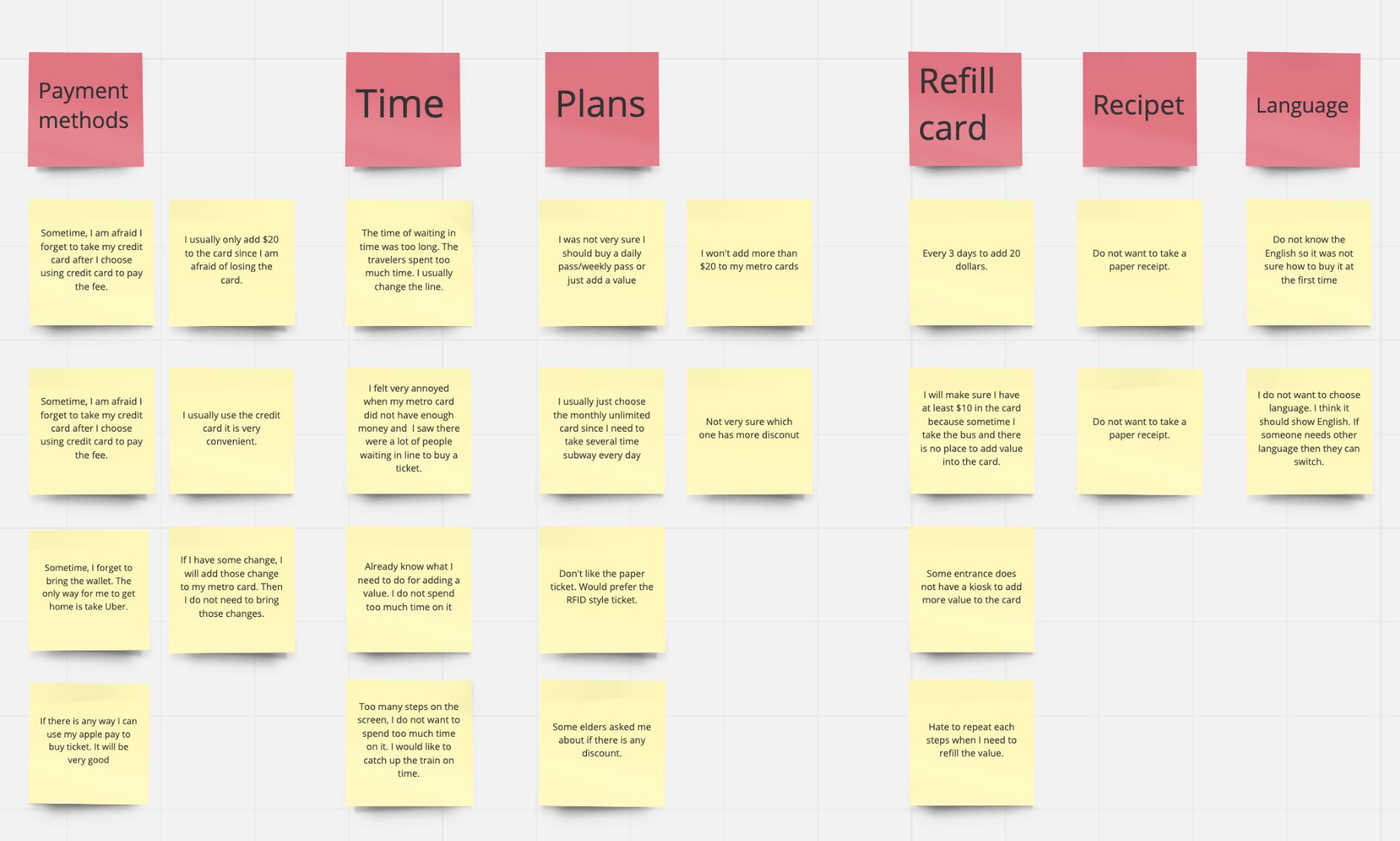
6 Interviews · Affinity Mapping
Three Pain Points Survived the Wall
Interview notes clustered into payment methods, time, plans, refill, receipts, and language. Three findings carried the weight: nobody wants to wait in line just to refill; locals know the drill while first-timers drown in plans; and multiple payment methods are non-negotiable.
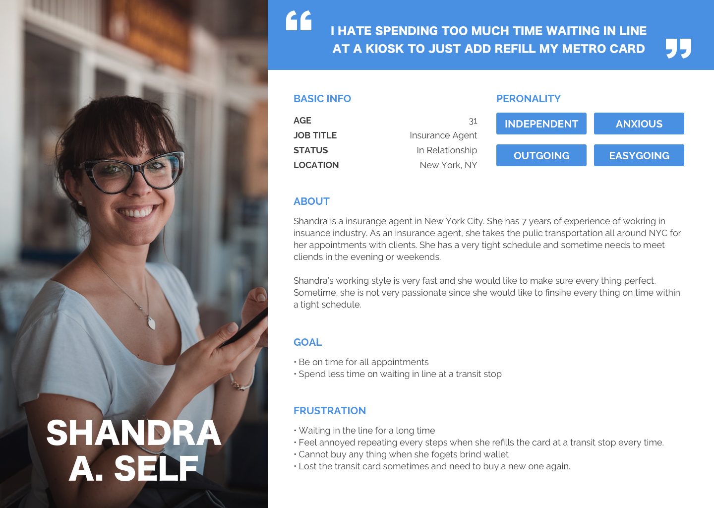
Persona · The Target Commuter
"I hate spending time in line just to refill my card."
Shandra, an insurance agent who rides daily and refills weekly, became the yardstick: independent, busy, mildly anxious about the queue behind her. Every flow decision was tested against her patience.
03 Shape Concept
Nine Flows In, Three Decisions Out
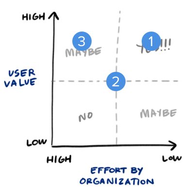
For each scenario — buy a new card, refill an existing one — I drew three candidate flows, then scored them the way a product team would have to: user value against engineering effort. Opinions argue; matrices decide.
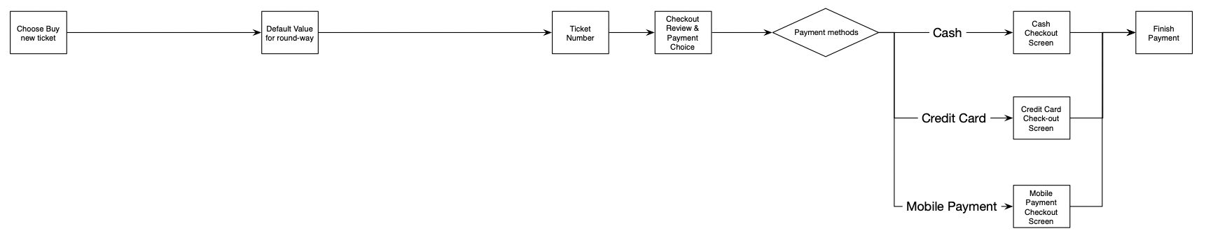
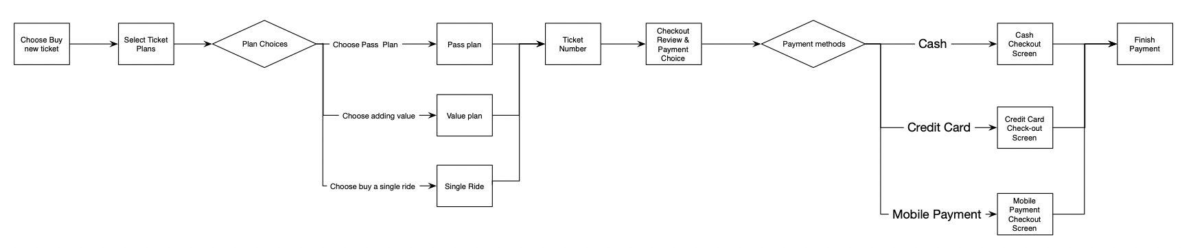
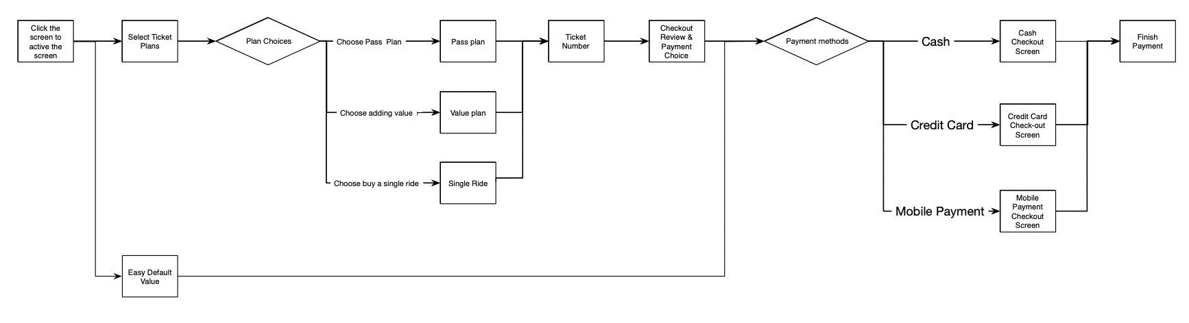
Option 1 — default value only. Fastest possible purchase, but regular riders lose access to their plans.Option 2 — show the full plan catalog up front. Complete, but exactly where first-timers stall.Option 3 — chosen. A fast default path for first-timers, the full catalog one tap deeper for everyone else.The decision tool: every option placed on user value × effort by organization before deciding.
01
Buy a new card → fast default + flexible plans
New riders get a one-tap default-value card; anyone who wants specific passes finds the full catalog one level deeper. High user value for both audiences, justifiable build cost.
02
Refill → one-click preset, with a priced fallback
The ideal flow lets riders save a preset (amount + payment) and refill in one tap. I recommended it — and explicitly priced the fallback: if engineering can't fund the account feature, option two still captures most of the value. Recommendations should come with their own plan B.
03
Card account → the piece that makes refill scale
Each card carries a number and a lightweight account holding the preset. It is the infrastructure bet behind the one-click promise.
04 Design & Validate
Sketch Fast, Test What Matters
Ten hours don't allow a full design cycle — so the cycle was compressed, not skipped. Four moves, in order: sketch everything, build only what testing needs, put it in front of riders, and let the data pick the answer.
01
Sketch
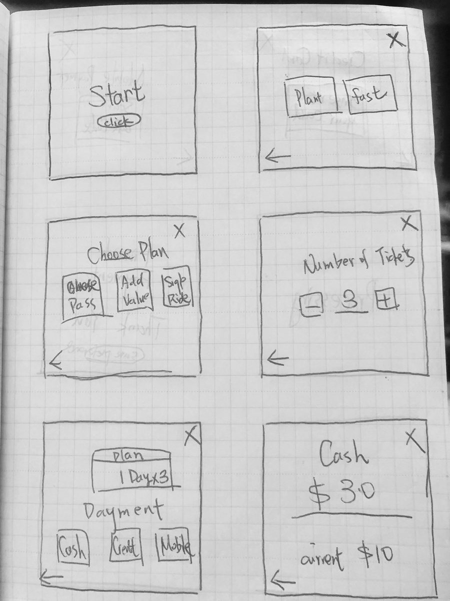
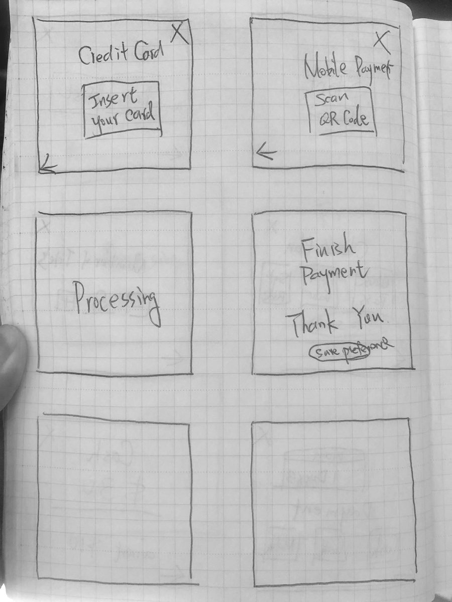
Every screen on paper first
A full screen-by-screen pass in pencil. At this fidelity iteration is free — layouts, payment states, and dead ends were all resolved before a single pixel was spent.
Paper pass: every screen sketched before any pixels were spent.Payment and confirmation, resolved on paper where iteration is free.
02
Prototype
Hi-fi only where testing needed it


No decoration passes. Only the two flows under evaluation were built at high fidelity — buying a new card, and the one-click refill.
Hi-fi prototype: buying a new card via the fast default path.One-click refill: preset amount and payment, done before the line notices.
03
Test
Put it in front of riders
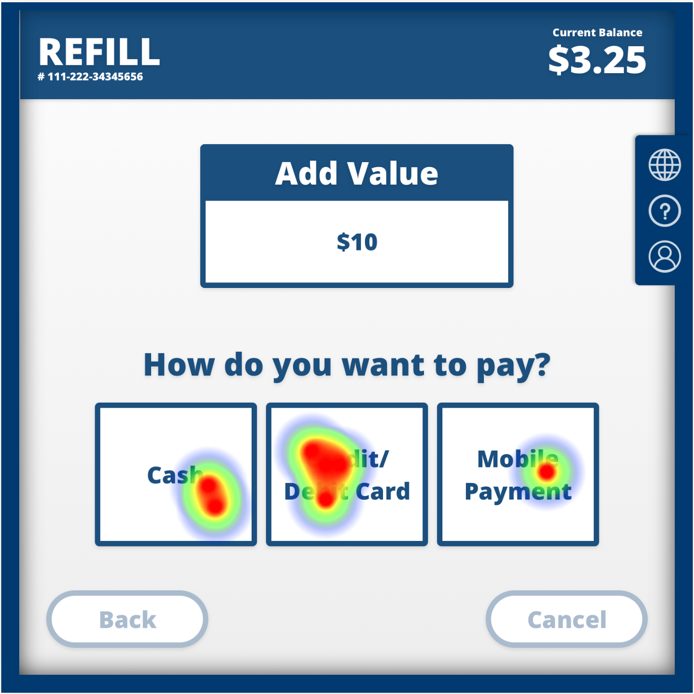
The prototype went straight back to users: first-click heatmaps on the critical payment step, with eight riders voting with their fingers.
Usability · Click Heatmaps + Survey
Let Riders Vote With Their Fingers
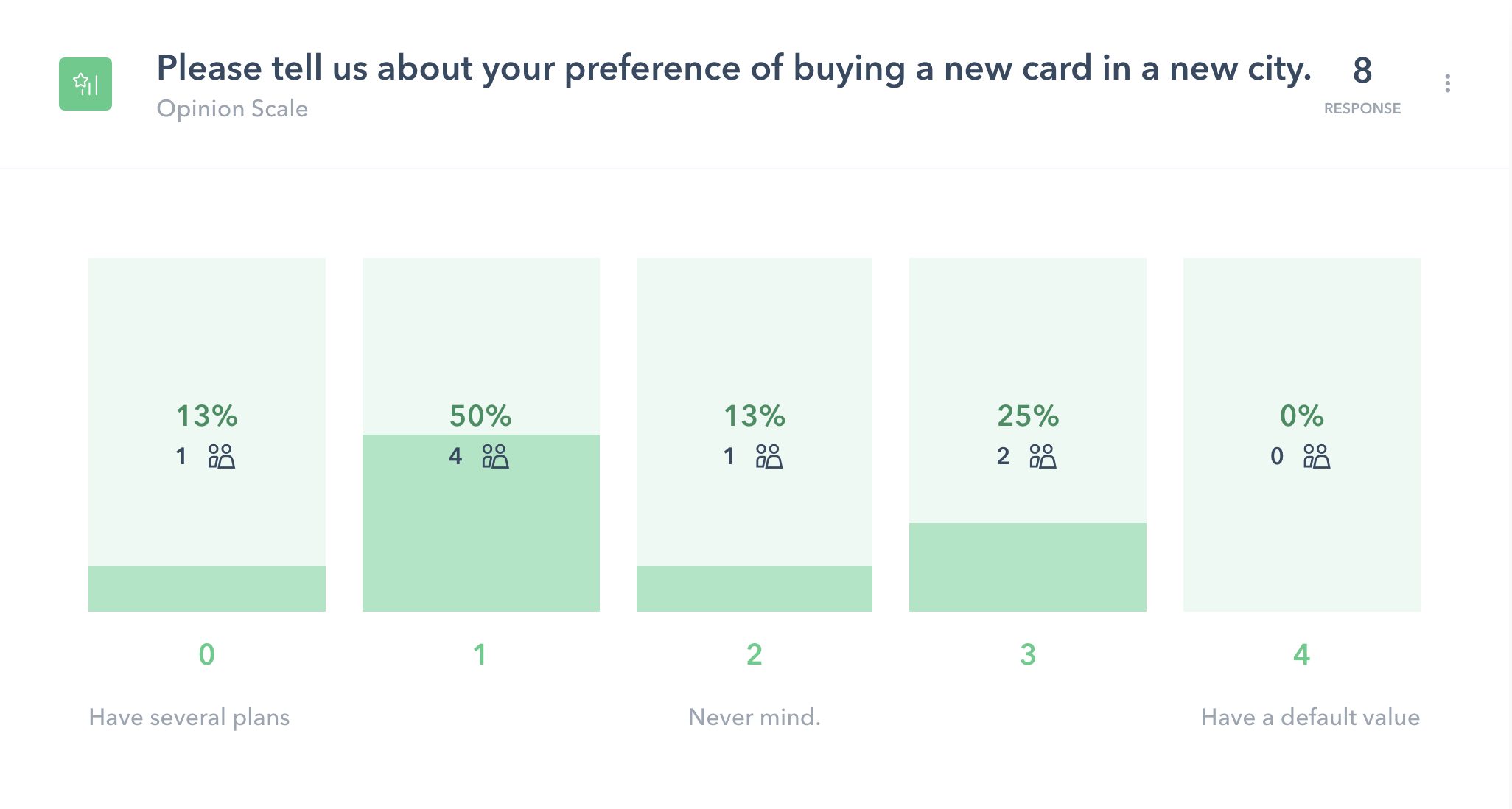
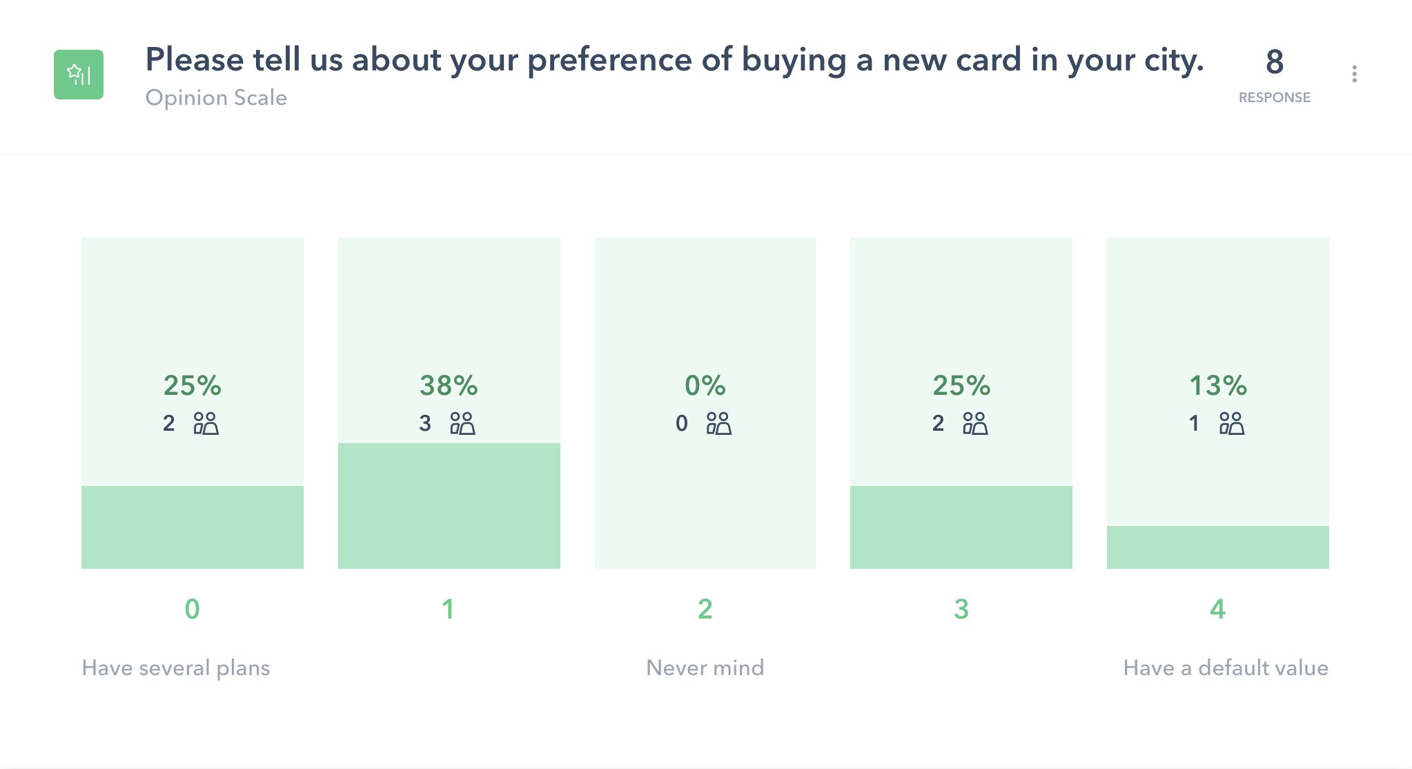
Heatmaps on the payment screen confirmed the three-method layout worked — card dominated, but cash and mobile earned their buttons. The 8-rider survey split exactly as the research predicted: in a new city people want a default value; in their own city they want their plans. "The simplest would be a default value for new clients," one tester wrote — the design already agreed.
04
Learn
A survey that split exactly as predicted
The plan question went to a preference survey. New-city riders leaned to a quick default; home-city riders wanted their own plans — confirming one flow had to serve both.
New city: riders lean toward a quick default value.Home city: riders want their own plans — both needs, one flow.
05 Outcome
What Ten Hours Bought
Not just screens — a defensible argument. Every design decision in the final prototype traces back to something a real rider did or said that week.
20+
Riders observed at 4 kiosks, 8am rush
6
Intercept interviews → affinity map
9→3
Flows scored on value × effort
8
Testers: heatmaps + preference survey
DECISIONS, DELIVERED WITH THEIR TRADE-OFFS
The submission didn't just show a favorite — it showed the runner-up and the conditions under which the team should choose it instead. Design recommendations that respect engineering capacity get built; ones that don't get shelved.
06 Reflection
Where the Operating System Started
Looking back from the Booking.com years, this little challenge is where the habits began: measure before designing, score options instead of debating them, and ship every recommendation with its trade-offs attached.
What Still Holds Up
Spending the first fifth of a tight budget on real users felt expensive at hour two and cheap by hour ten. The value × effort matrix from this challenge became the same muscle behind the impact × confidence prioritization I later ran at Booking.com.
What I'd Do Differently Now
Accessibility would be a first-class requirement, not an afterthought — reach ranges, language switching, and screen-reader flows for a public kiosk. And I'd recruit beyond convenience sampling: eight testers taught me directions, not confidence intervals.