
This one’s locked.
This one isn’t public. Promoted Users · B2C→B4B requires a passcode.
This one isn’t public. Promoted Users · B2C→B4B requires a passcode.
Roughly 30% of Booking.com's bookings were business trips made on the leisure product. I led the design of the first cross-system journey that identifies these travelers and routes them to Booking.com for Business — without disturbing the B2C experience.
00 Overview
Booking.com for Business existed — but the people who needed it were booking work trips on the leisure site, unaware and unserved. The brief: design the entry point that converts them. My reframe: before designing anything, prove where they are, establish a baseline, and only ship what an experiment can defend.
~30% of bookings were business trips on the B2C flow, and 0.83% of all bookings were made on behalf of someone else. B4B offered higher ARPU and longer stays — but had no systematic path from the main site.
The confirmation-page entry shipped to live experimentation: 50% CTR on the sign-up CTA after exposure, 114 new companies in the first two weeks, and the foundation for next year's 50K SME target.
Led design strategy and roadmap, ran the baseline and hypothesis work, executed user testing and data analysis, and aligned four internal teams plus our external partner, Serko, on one cross-system journey.
~30% of bookings were business trips stuck on the leisure site.
02 BaselineOne month of A/A measurement before designing anything.
03 HypothesisA written bet: ≥1% lift — with B2C guardrails that must not move.
04 AlignOne journey negotiated across four systems and five teams.
05 Experiment+1.42% registrations, guardrails intact. 114 companies in two weeks.
06 LearnThe 70K survey a year later: the door worked — the room wasn’t done.
01 Context
Booking.com's leisure product and Booking.com for Business ran as separate systems — separate teams, separate platforms, separate accounts. Business travelers landing on the B2C site simply stayed there, paying leisure prices for work trips and getting none of the B4B value.
~30% of bookings were business trips. 0.83% of all bookings were made for someone else — the fingerprint of "travel arrangers" booking on behalf of colleagues.
Business accounts brought higher average booking value and longer stays — a blue-ocean growth channel sitting inside our own traffic.
Any intervention lived on pages owned by other teams, serving hundreds of millions of leisure users. The B2C booking rate was untouchable.
Target the Booking.com users who would genuinely benefit from B4B, raise awareness of the product where they already are, and lift the registration rate — measured, guard-railed, and reversible at every step.
02 Clarify Problems
Growth work fails when you can't tell your effect from the noise. Before designing a single screen, I established the baseline: who is naturally business-inclined, and how many would convert with no intervention at all?
The booking flow already asked two optional questions. For one month we simply measured the answers — no design changes — to quantify the natural base rate of self-identified business travelers and arrangers. This became the denominator every later experiment was judged against.
Workshops with the B4B team sharpened the focus onto travel arrangers — the people booking for others — alongside individual work travelers. A market review of how comparable products bridge leisure and business accounts rounded out the picture.
03 Shape Concept
Every experiment shipped against a written hypothesis: what we're changing, the direction and size of the effect we expect, the user psychology behind it — and the guardrail metrics that must not move.
📐 Hypothesis Template
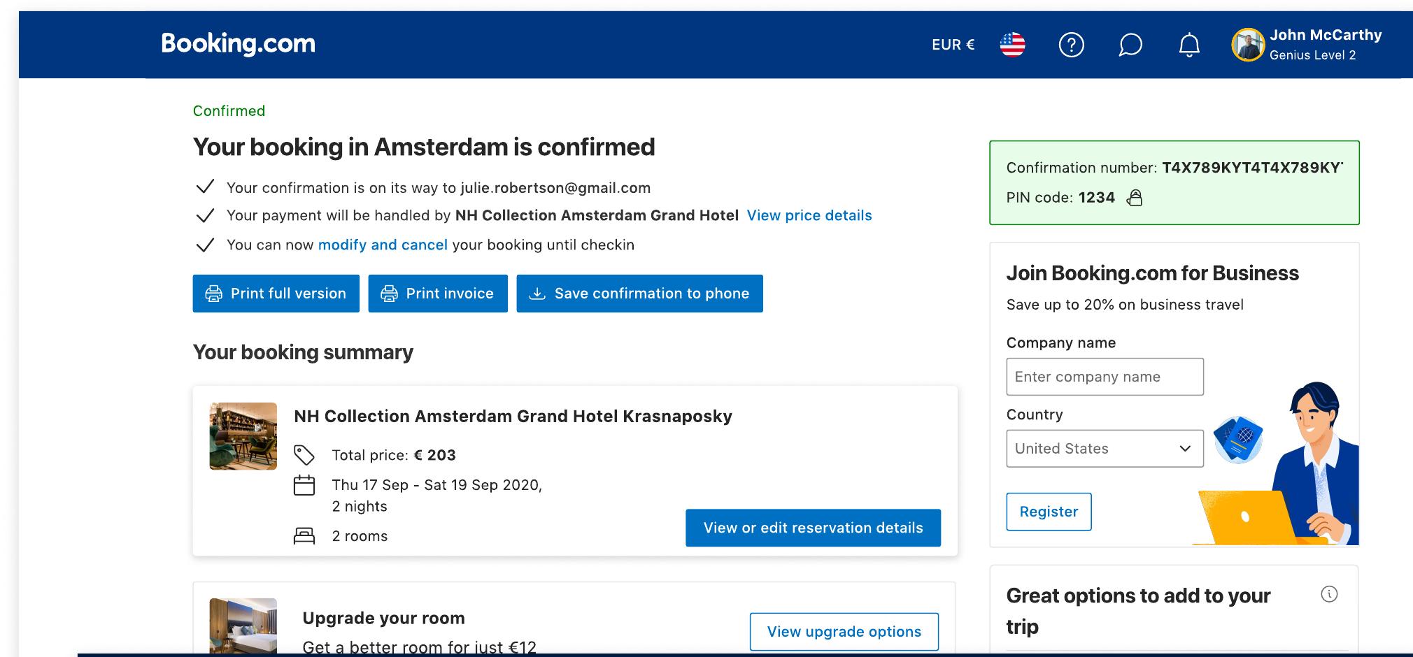
We believe adding a business-dedicated entry card to the booking confirmation page will lift B4B business registrations by at least 1%, because business travelers carry high decision costs — a clear signal tells them they've been seen.
While monitoring two guardrails: B2C booking rate and page load speed — neither is allowed to regress.
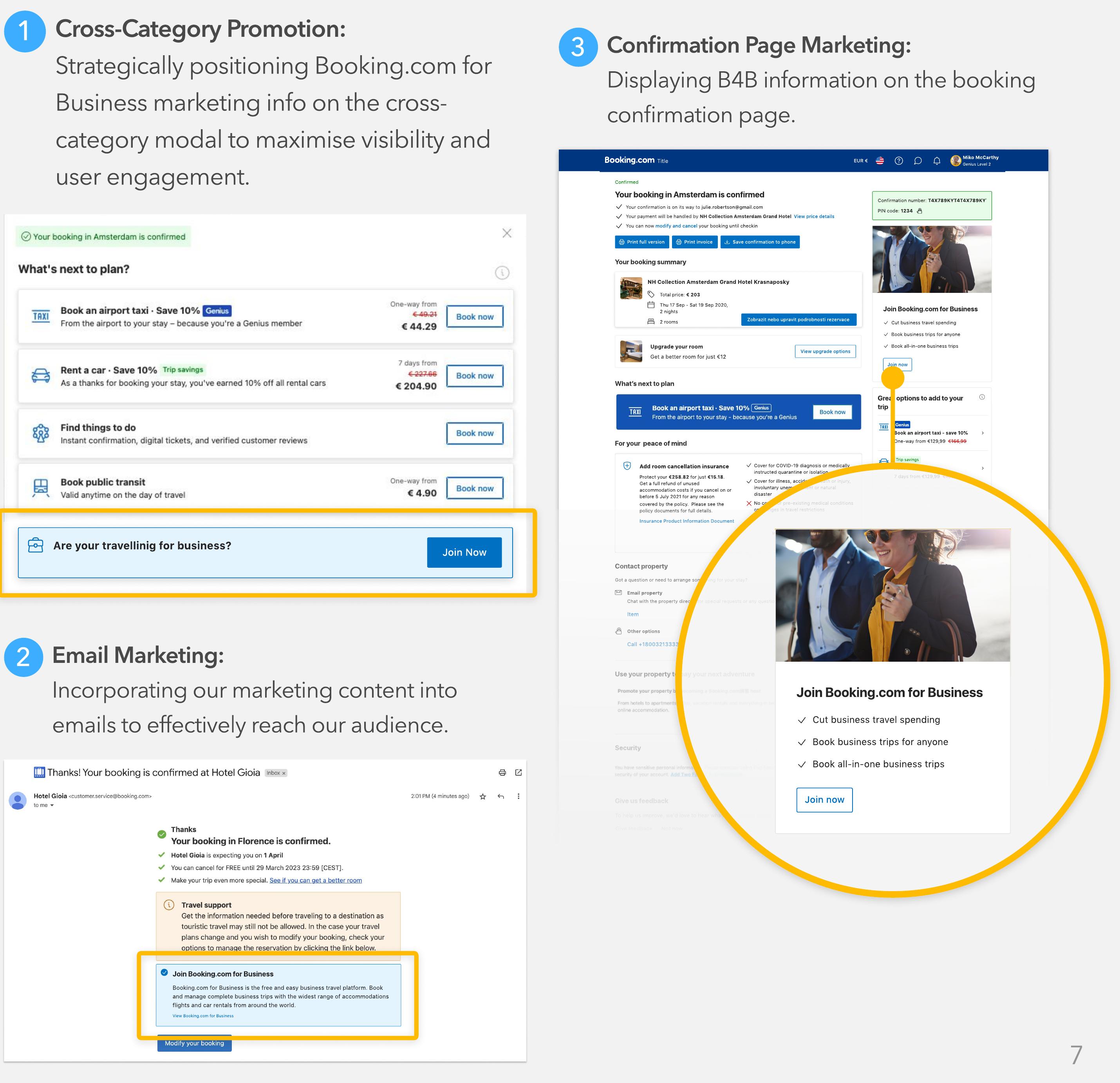
We ideated three routes — a cross-category promotion modal, email marketing, and the booking confirmation page — then prioritized as a team. The confirmation page won: every user passes through it after booking, it's the exact moment "travelling for work" is fresh, and it lets us identify arrangers and work travelers precisely. I negotiated placement within the post-booking team's established guidelines to get maximum visibility without breaking their page.
04 Test & Ship
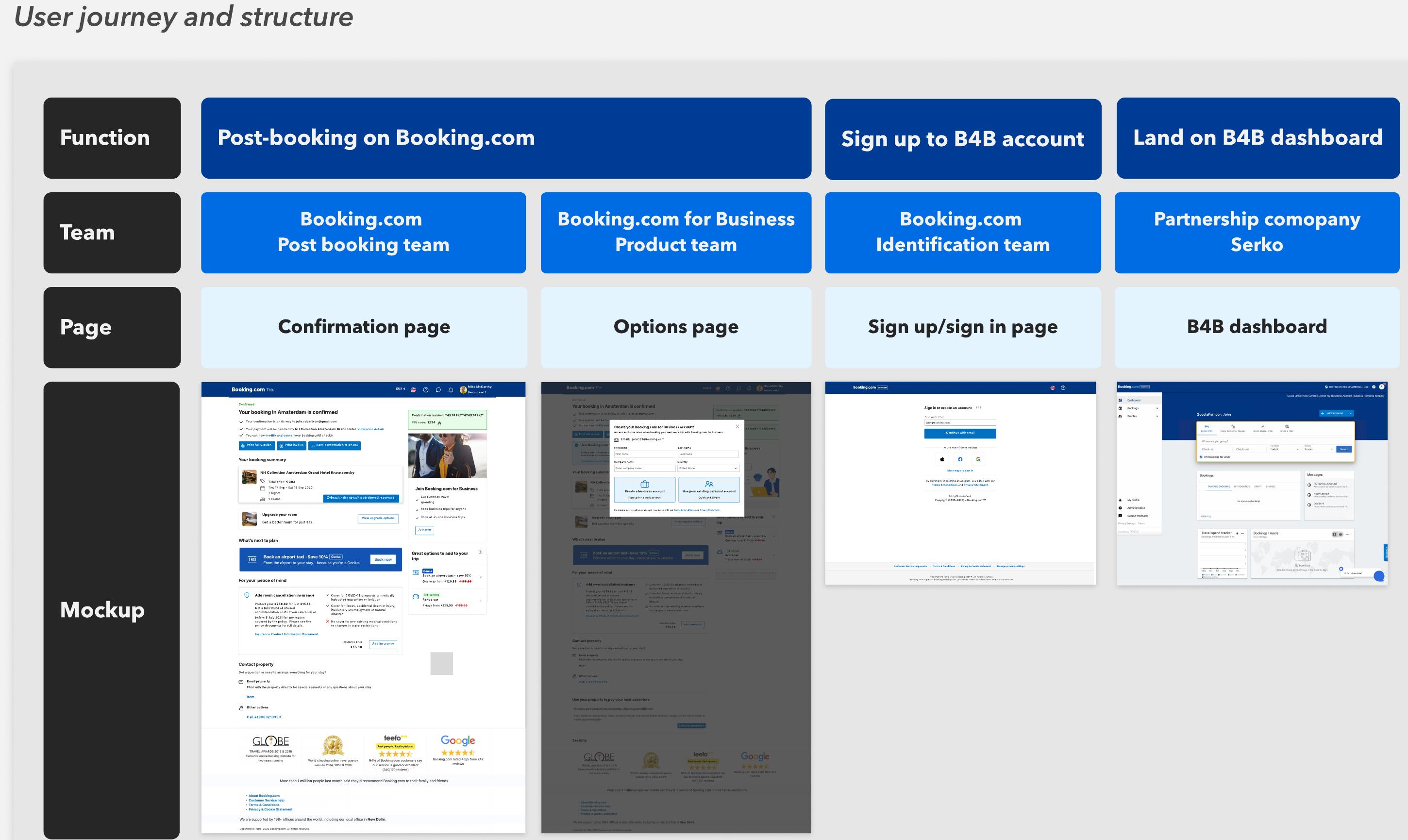
The "simple" entry card crossed four platforms — Booking.com post-booking, the identification system, the B4B product, and our partner Serko's stack. My first vision of one-click account migration died in feasibility review; I re-ideated the flow with B4B engineers until it was both user-friendly and technically real.
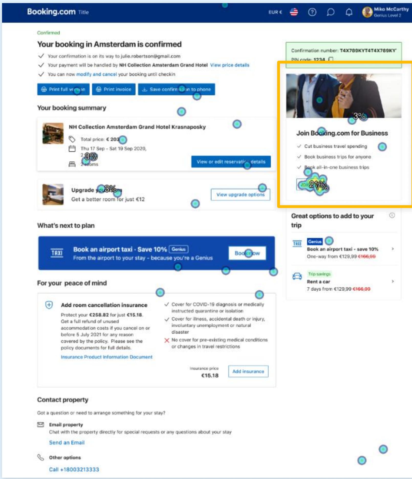
With the flow settled, I ran 8 unmoderated usability sessions plus first-click tests with 58 US users who had booked business trips in the past 6 months. Three insights drove the final design:
38% of users noticed the B4B promotion in its position — the most-focused element on the page. Decision: retain the position, push key content above the fold.
Users wanted concrete product benefits before committing. I paired with our UX writer on short and long variants that lead with value — savings, booking for anyone, all-in-one trips.
"What's the advantage of joining with the same Booking.com account?" We rewrote the choice as two clear paths: create a business account, or continue with your existing personal one — quick and simple.
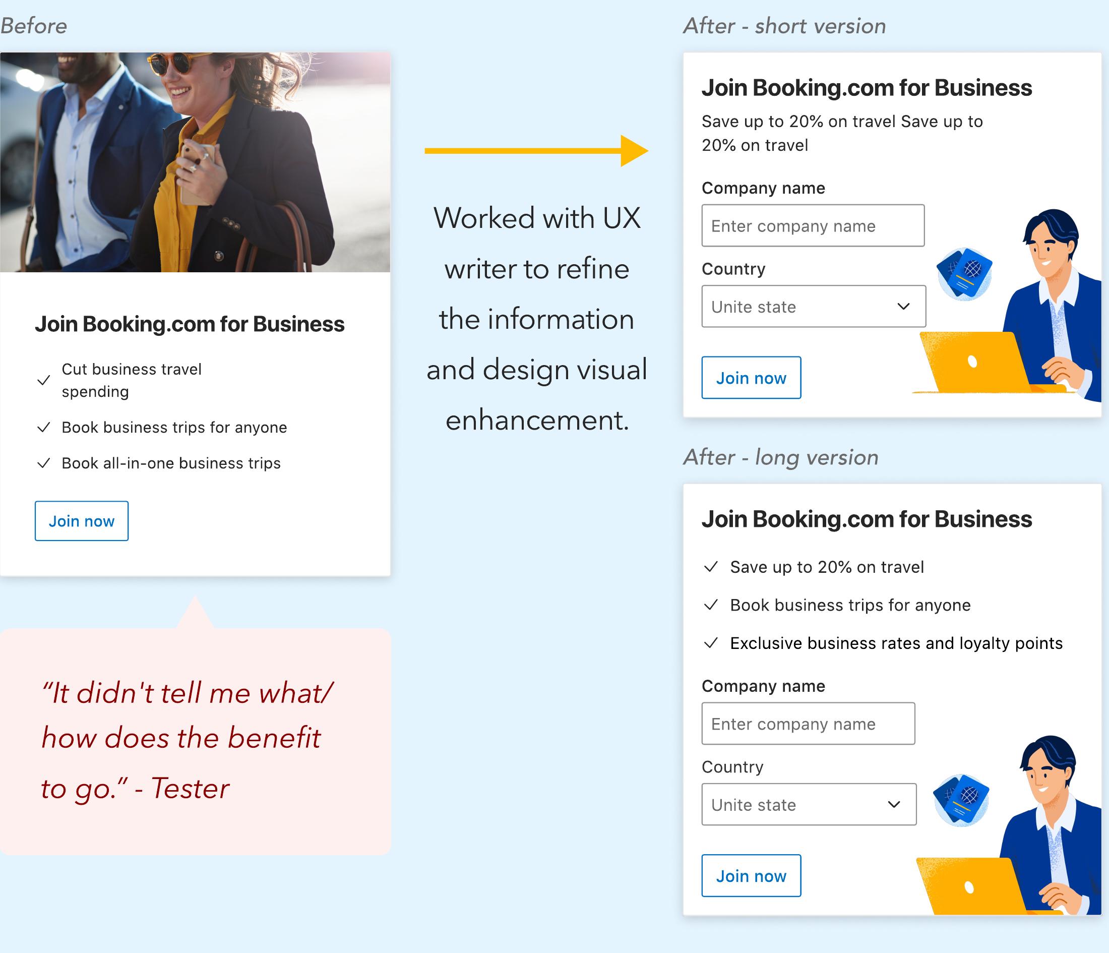
The final design places "Join Booking.com for Business" directly on the confirmation page, with refined benefit-led copy and a clear two-path account choice behind it. In the live experiment, the winning variant moved the metric by +1.42% (±0.13) — clearing our ≥1% hypothesis with guardrails intact.
05 Impact
Two weeks into live experimentation, the signals were exactly what the hypothesis asked for — modest in absolute terms, decisive as evidence.
Beyond the numbers, this was Booking.com's first experiment spanning internal and partner systems — the working blueprint for the 2024 roadmap: email experiments, cross-sell collaborations, and the "I'm travelling for work" feature on the leisure site, all aimed at 50,000 SME users.
06 Reflection
A year after full-on, we surveyed the users who had converted through this entry — 70K message recipients. The honest answer: we had built a great door, but not yet a great room behind it.
The discipline. A/A baseline before touching anything, written hypotheses with guardrails, and placement decisions negotiated with data instead of opinions. When the variant won (+1.42%), everyone trusted it — because everyone had agreed on the rules beforehand.
Winning the entry-point experiment is not the same as designing a successful transition. The survey data made it plain: acquisition without immediate, felt value creates disappointed users. I'd pair every acquisition experiment with a first-week value experiment from day one.