Civic Tech Enterprise Platform Zero Waste

donateNYC Web Application

An enterprise-level web portal helping NYC community groups, businesses, and government agencies donate or find used goods and surplus food—one piece of the city's push to send zero waste to landfills by 2030.

Duration
1 year
Team
3 Designers, 1 PM
Role
UX & Visual Design
Status
Shipped on nyc.gov
Year
2018–2019

00 Overview

The Moment & The Brief

New York City runs on surplus—restaurants with extra food, offices with extra furniture, nonprofits that need both. donateNYC existed to connect them, but its account system was built for individuals, not organizations. The brief: make the platform work for enterprises with many locations and many staff.

One account per business

Entire organizations shared a single login. Staff across dozens of store locations couldn't post or respond to donations independently—and the sign-up form was so long we lost users before they finished it.

An enterprise donation platform

Two-step registration, multi-user account management, and a food-matching workflow—shipped as part of NYC's 0X30 initiative, live on nyc.gov for donors, recipients, and city agencies.

Product Designer

User research, interaction design, visual design, prototyping & testing. I owned the enterprise registration experience end-to-end—from stakeholder interviews to developer handoff.

Key Responsibilities

  • Conducted user interviews and secondary research with 2 designers & 1 PM
  • Owned UX + visual design for enterprise registration
  • Designed the information architecture and design style guide
  • Delivered hi-fi interactive prototypes for the development team

01 Context

Why This Mattered

donateNYC provides vital support for New York City's reuse community. By donating and reusing goods instead of discarding them, New Yorkers reduce waste, conserve resources, save money, and help provide jobs and human services for New Yorkers in need.

The Initiative

NYC 0X30 — Zero Waste by 2030

donateNYC is an essential part of NYC's 0X30 initiative: helping New Yorkers reach the goal of sending zero waste to landfills by 2030. Every donation kept out of a landfill counts toward a citywide target.

The Mission

Connect Surplus to Need

Create a donateNYC food and goods portal—a digital tool connecting businesses with excess edible food to organizations throughout NYC that can put it to use.
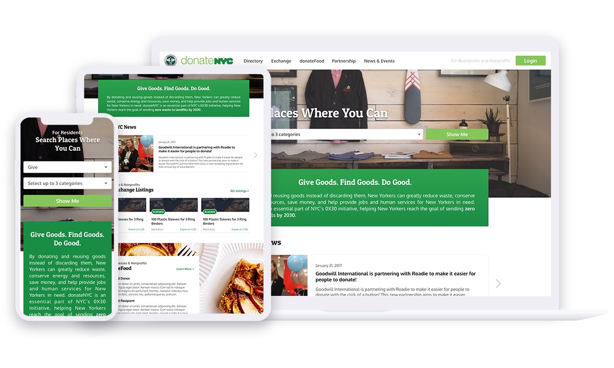
donateNYC responsive web application on desktop, tablet and mobile
The shipped donateNYC portal — responsive across desktop, tablet, and mobile.

02 Clarify Problems

The Research Told a Different Story

I partnered with two designers and a product manager to understand how food and goods organizations in NYC actually work. We ran user interviews and secondary research on the existing platform—and the registration flow kept coming up.

01

User data was not clean

Duplicated locations and company information everywhere. For the city government, the data was messy and hard to organize—which undermined the reporting the program depends on.

02

One business had only one user account

All staff members shared one login. For an enterprise-level business with many store locations, managers couldn't organize stores they weren't familiar with.

03

The sign-up form was too long

We were losing users mid-registration because the form demanded everything up front—organization details, exchange data, and food donation data all at once.

The Challenge

How might we enhance the usability to allow multiple users to use new enterprise accounts to post and respond to donations?

03 Shape Concept

Six Stakeholders, Three User Types

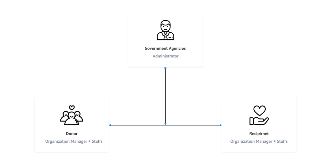
NYC's rescue and donation ecosystem has six kinds of stakeholders—donors, food rescue organizations, facilitators, recipient agencies, associations, and government agencies. A platform that scales to billions of donations can't model six roles. We simplified to three.

Three user types: Government Agencies as administrator, Donor and Recipient as organization manager plus staffs
Donor · Recipient · Government Agencies — each organization gets a manager plus staff accounts.

Design Decision #1 — Two-Step Sign Up

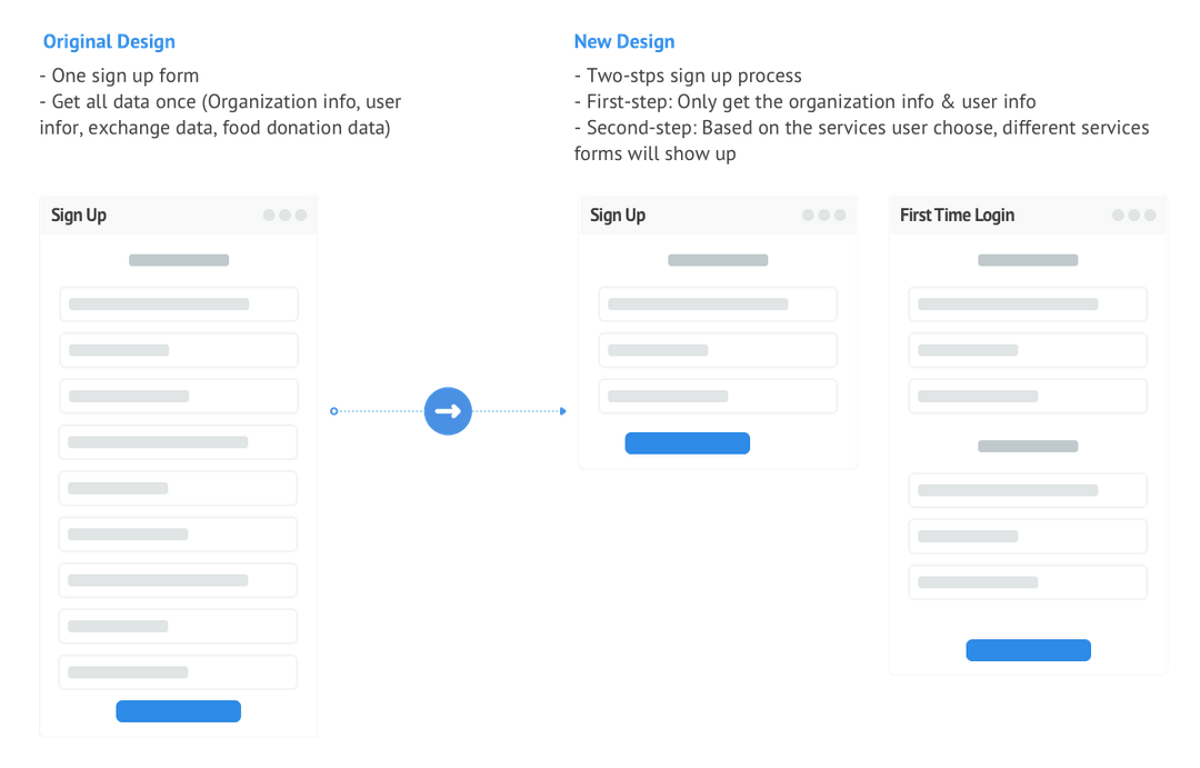
The original flow asked for everything in one giant form: organization info, user info, exchange data, food donation data. We split it: step one collects only what an admin needs to approve the account; step two—at first login—asks service-specific questions based on what the organization actually chose. Shorter form, more completions, cleaner data.

Original one-step sign up form compared with the new two-step sign up process

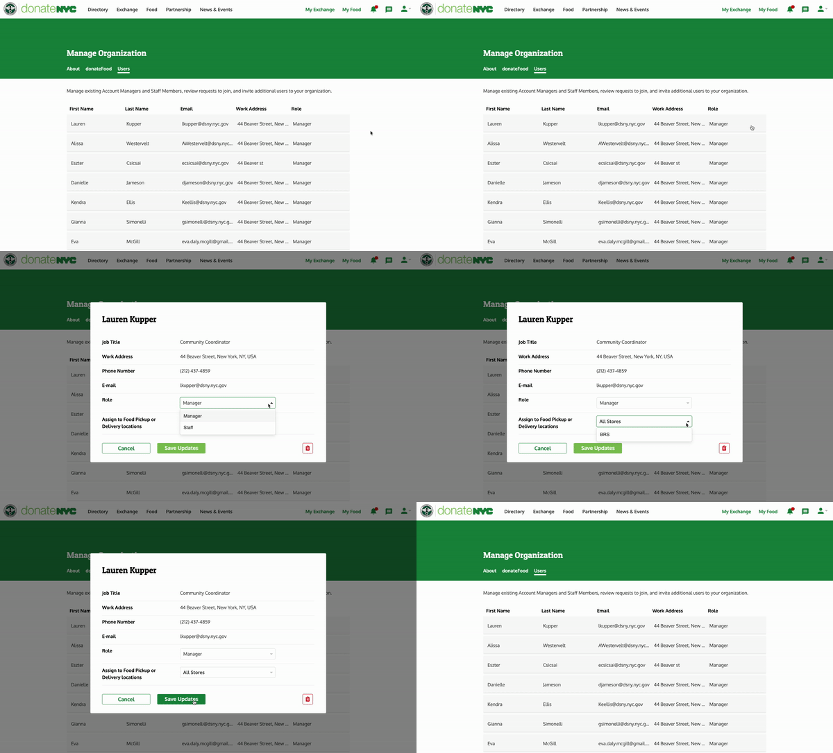
Design Decision #2 — Enterprise Account Management

Each business entity can now hold multiple branches, locations, and users. Managers assign staff to specific sites within the same business account—so donation notifications reach the right person at the right store, and the shared-login era ends.

Manage Organization screen with staff roles and store assignments

04 Design & Build

Thinking in Products, Not Only in Features

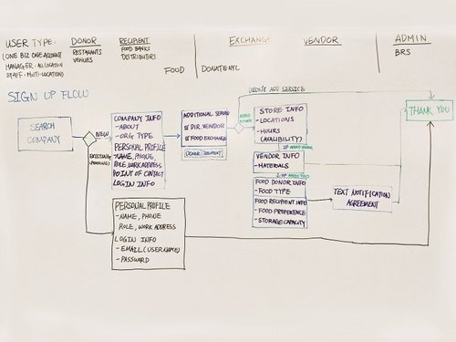
Across a year of development we followed a user-centered design process—requirement, research, wireframe, prototype, design review, user testing, dev, QA, beta, launch—to make sure we weren't just shipping features, but building the right product.

Whiteboard brainstorming and sticky-note iteration of the registration flow
Brainstorming and iterating the enterprise registration flow.
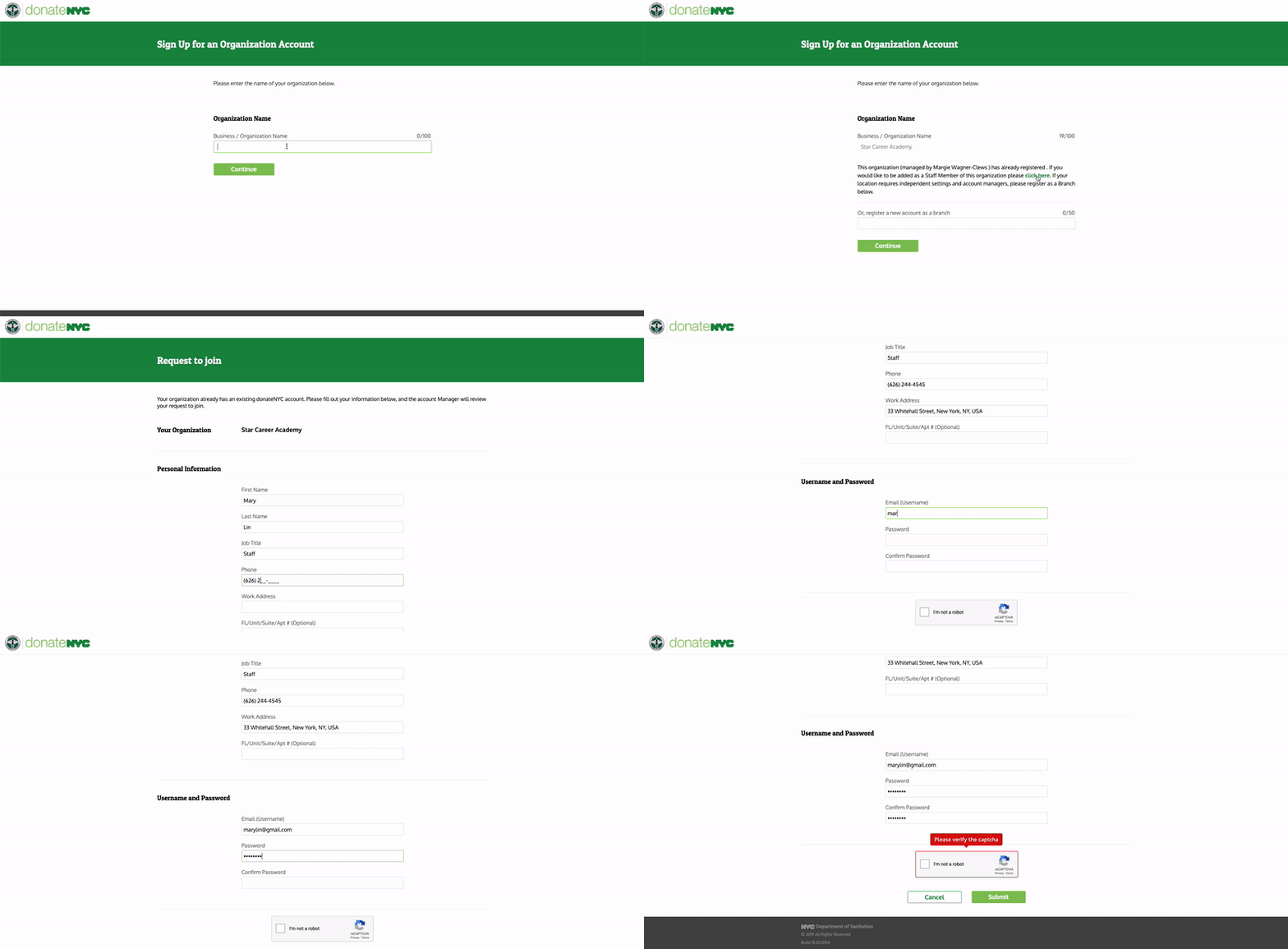
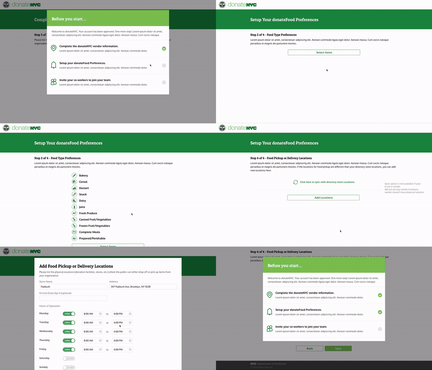
Two-step registration sign-up screens
The shipped two-step sign-up, recorded in the live product.

From Signed Up to Set Up

Registration gets an organization in the door — activation is what makes it productive. After approval, a guided checklist walks each new organization through completing its vendor profile, setting donateFood preferences, and inviting co-workers, so accounts arrive at their first donation ready to act.

Onboarding checklist modal guiding a new organization through vendor info, preferences, and inviting co-workers
The post-approval checklist: three steps from empty account to active vendor.
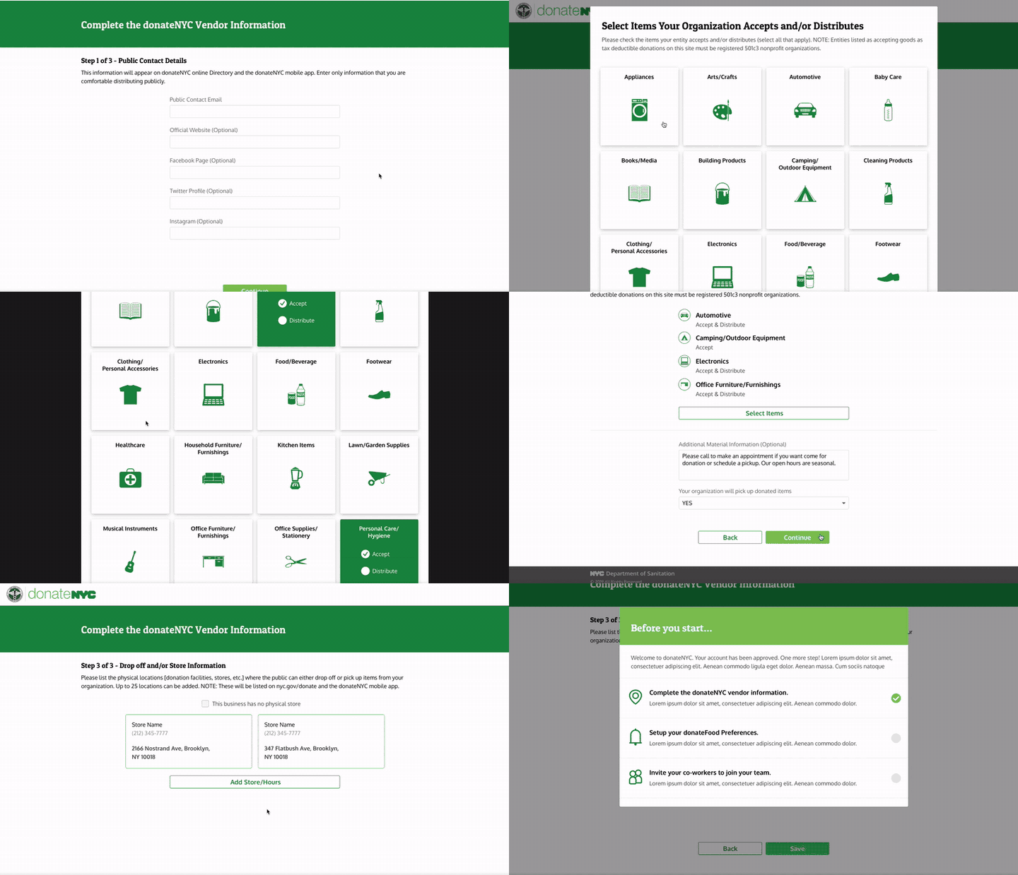
Three-step vendor information wizard collecting public contact details
The vendor-profile wizard — only public-safe details, three short steps.

Setting Up the Information Architecture

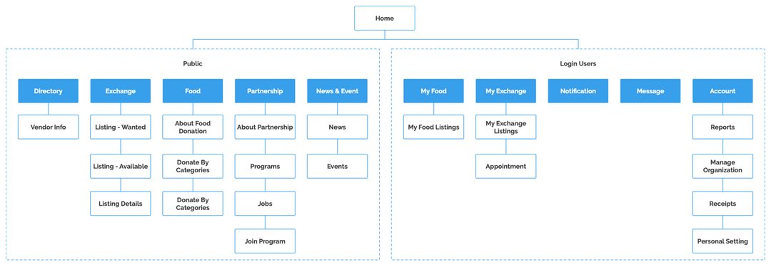
The sitemap separates the public surface (Directory, Exchange, Food, Partnership, News) from the logged-in workspace (My Food, My Exchange, Notifications, Messages, Account)—so casual browsers and enterprise users each get a coherent home.

donateNYC sitemap showing public pages and logged-in user pages

Defining Patterns — Design Style Guide

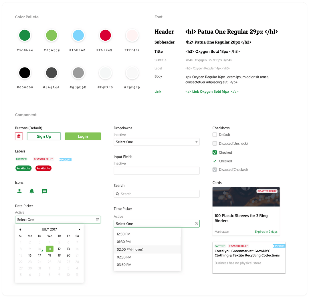
I documented the palette, type system, and component library—buttons, labels, cards, pickers, form fields—so three designers and a dev team could ship one consistent product.

donateNYC design style guide with color palette, typography and components

05 Key Features

Give Goods. Find Goods. Do Good.

What shipped wasn't just a registration fix—it was a full donation workflow for the city, from discovery to hand-off.

Key Feature 1

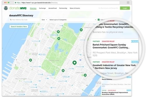
Directory Map

An interactive map shows all vendor lists and locations in one place. Users filter by location, donation type, and categories to find the right vendor faster.

Interactive directory map of donation vendors across NYC

Key Feature 2

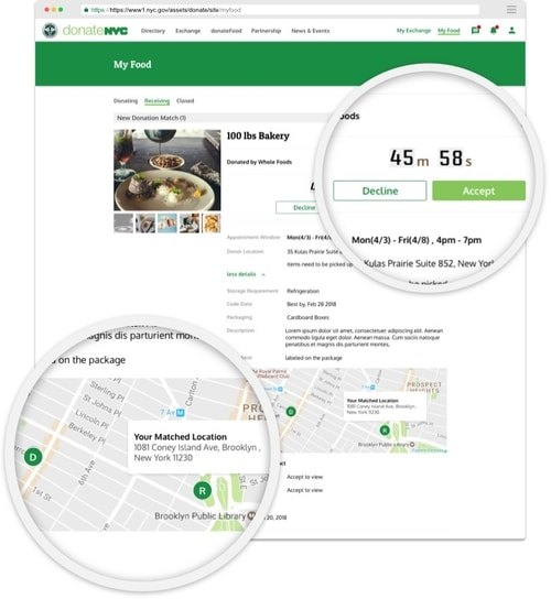
Food Donation Matching

A matching process between donors and recipients increases food donation chances. A countdown timer ensures all 25 recipients on the list have enough time to respond and accept or decline the listing—so edible food moves before it expires.

Food donation matching screen with countdown timer and accept/decline actions

Key Feature 3

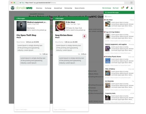
Integrated Messaging

Donors and recipients correspond through the system itself. The messaging platform streamlines communications and keeps a record—ensuring service quality and accurate transaction and tonnage data for the city.

Multi-platform integrated messaging system

Key Feature 4 & 5

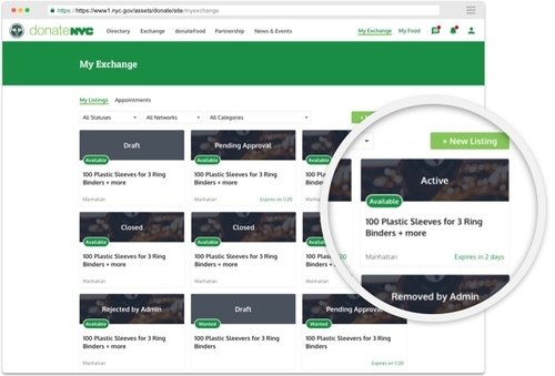
Listing Cards & Scheduling

Exchange listing cards surface each listing's title, status, and deadline at a glance. A scheduling system opens windows of availability for pick-up and delivery, matching donations on both parties' preferences.

Exchange listing cards with status and deadlines

06 Reflection

Overall Impact

I designed the business requirements from early conceptualization through final visual design—for desktop, tablet, and mobile. It was my deepest lesson in designing for organizations, not just users.

What Made It Hard

The biggest challenge was understanding the business requirement itself: a government product with a completely different conceptual model from regular donation platforms. The complicated structure demanded I learn how to build a product, communicate with the development team, and be a good liaison between developers and the product team.

What I Took Away

I leveraged research and user journey mapping to understand the system and successfully revamped enterprise registration—even as the tasks grew more complicated. I believe a professional product designer shouldn't just try to solve problems, but should take the users' perspective into account at every step.

SHIPPED FOR THE CITY

The donateNYC portal went live on nyc.gov—giving donors, recipients, and government agencies one platform to give goods, find goods, and do good, in service of a zero-waste New York by 2030.